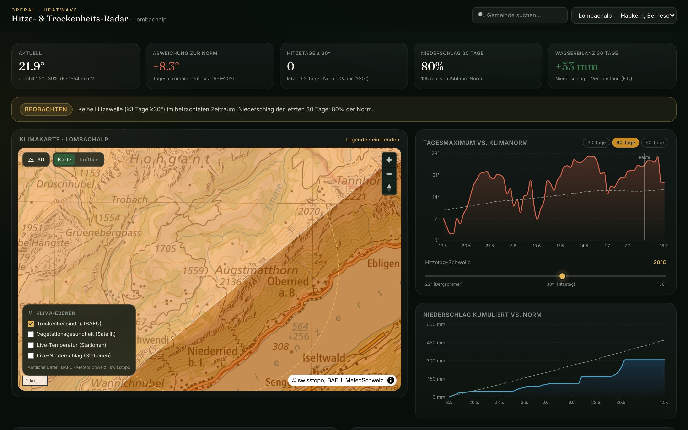
“Is this hot, or is it unusually hot?” For a farmer, a ranger, an alpine community or a risk manager, that’s the question that matters — and it’s surprisingly hard to answer for your own valley. The raw data exists in official Swiss and European archives, but turning it into a straight answer for one specific place has meant a specialist and a spreadsheet.
So we built the Heat & Drought Radar: type any Swiss municipality, and it draws that town’s live heat-and-drought picture on one screen.
Not the temperature — the anomaly
The headline number isn’t today’s reading; it’s today’s reading against the 1991–2020 climate normal. A day at 22 °C means nothing until you know it’s +8 °C above what this place used to be. Around that sit the numbers that actually describe stress: heat days above an adjustable threshold, 30-day precipitation as a share of the norm, and a water balance — rainfall minus evapotranspiration — that turns “it’s been dry” into a signed figure.
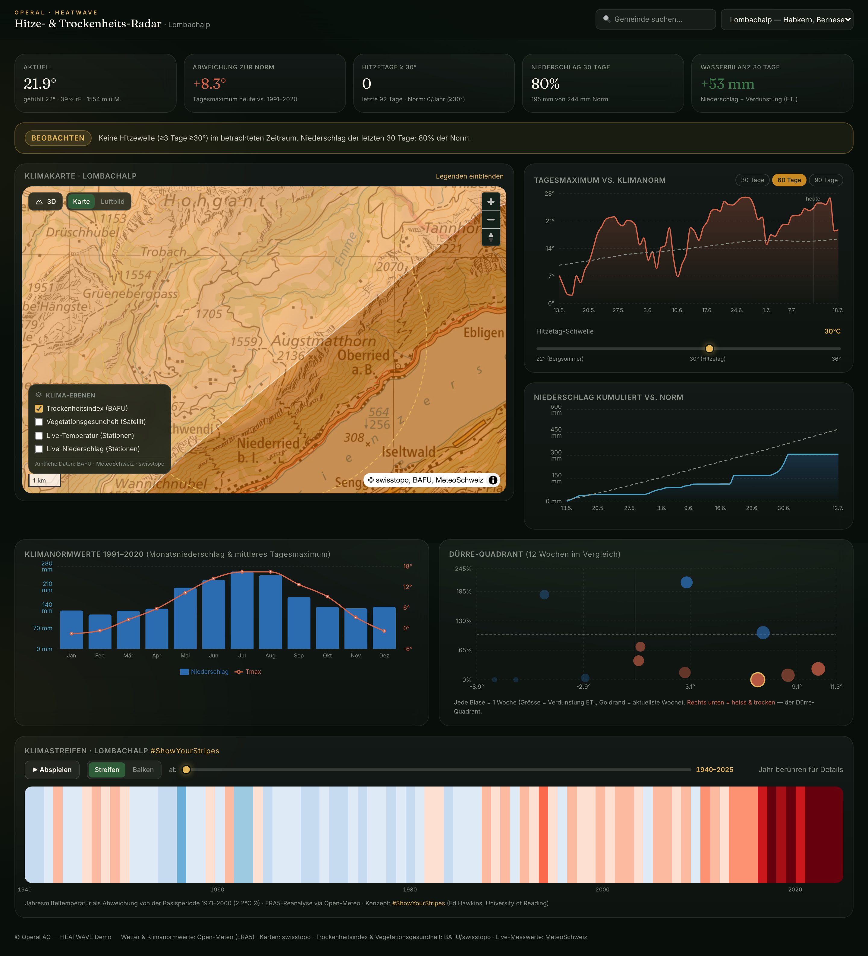
Underneath sits a climate map on swisstopo basemaps, with BAFU drought-index and satellite vegetation-health overlays and live station data, in 2D or 3D terrain. A drought quadrant plots the last twelve weeks by heat and dryness together — because the dangerous corner is hot-and-dry at once, not either alone.
Ending on the long view
Every town’s radar closes with its #ShowYourStripes warming stripes — annual mean temperature from 1940 to today, blue to red — so a snapshot of this summer lands inside the trend it belongs to. It’s the single most legible climate graphic ever made, drawn for your municipality.
Everything is grounded in official public data — Open-Meteo/ERA5 reanalysis, swisstopo, BAFU and MeteoSwiss — with every source named in the footer. No proprietary black box, nothing you can’t trace.
The climate record was always public. The Heat & Drought Radar just answers the only question most people actually have: how unusual is it, right here?